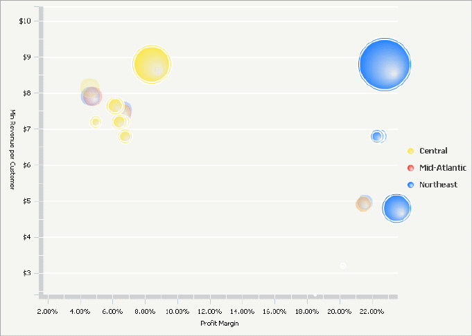
An Interactive Bubble Graph widget is a bubble plot that lets you visualize the trends of three different metrics for a set of attribute elements.
In the Interactive Bubble Graph:
One bubble is displayed for each attribute element.
Each bubble’s position on the X-axis represents the value of the first metric.
Each bubble's position on the Y-axis represents the value of the second metric.
The size of each bubble represents the value of the third metric.
Different groups of attribute elements are displayed as different colored bubbles when an additional attribute is placed above the first three metrics on the columns. For details, see Creating an Interactive Bubble Graph widget.
To analyze data in the Interactive Bubble Graph widget:
To view metric information for a bubble, hover over the bubble.
To highlight groups of related data in the widget, hover over an item in the graph legend to highlight all bubbles associated with that item.
To see underlying data within a bubble, double-click on any of the bubbles. For example, you can drill on a Region bubble (the parent attribute) down to bubbles that represent different cities (child attributes) within that region.
To see an animation that plots the bubble values through time, move the time slider or click the animation play button.
If the document contains a grid/graph report or panel stack that is connected to this widget, click a bubble in the graph or an item in the graph legend to display related data in connected grid/graph reports and panel stacks.
Not all features described above may be enabled in all documents.
Related topics